
In the last of a 3-part series, senior colourist Sam Chynoweth at The Farm talks about grading the most recent season of ‘Black Mirror’, delivering an independent look for each episode.
This article is the third in a 3-part series, in which senior colourist Sam Chynoweth at The Farm post studio in London talks about colour grading the most recent season 7 of television series Black Mirror, giving an independent look to each episode. Each article covers the grading work for a different episode in depth. Find part one here, and part two here.
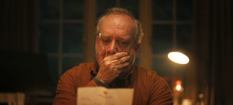
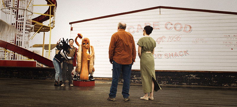
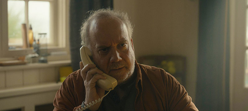
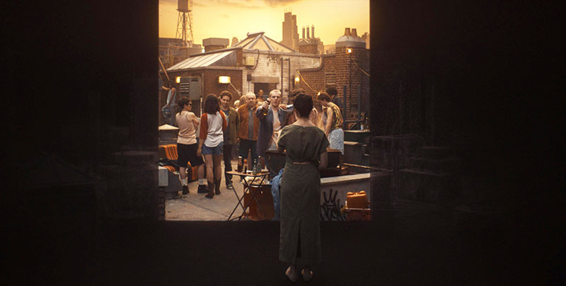
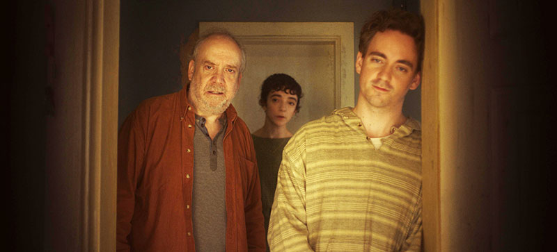
‘Eulogy’ is the title of episode 5 from the series, following an isolated man as he finds his way through an intriguing system that allows its users to step inside old photographs, stirring powerful emotions in the process.
The show’s cinematographer Álvaro Gutiérrez said he was immediately drawn to 'Eulogy' because of its tremendous visual potential. He commented, “We knew we could create a rich variety of looks while keeping everything grounded in the story. The link between memory and photography gave us an amazing foundation to explore different textures and visual languages.”
Colourist on the project Sam Chynoweth talked about the production’s goal for the look of the episode and how it would support the emotional play on memory and nostalgia.
Between Camera and Colour Grade
“Since the story centres on our protagonist Phil and his fragmented recollections, we aimed to give each of the seven time periods in his life a unique visual identity,” Sam said. “These distinct looks weren’t just about temporal clarity, but about evoking an emotional response from the audience, helping them connect to Phil’s memories as well as their own.”
To achieve this, Sam worked directly with Álvaro and the team. From the start, their collaboration emphasised the creative. “We didn’t just jump into technical discussions,” said Alvaro. “We went deep into the story first, really understanding what we could do cinematographically and in the grade to enhance those nostalgic feelings the narrative was trying to evoke. That shared understanding of the emotional core made all the technical work that followed feel purposeful and authentic.”
Defining Seven Looks
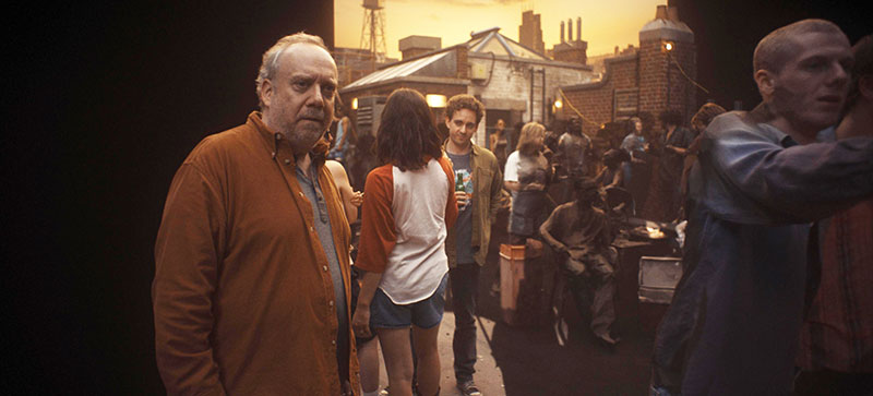
Sam treated the modern-day with a clean, neutral grade, to ground the viewer in the present. In contrast, the other looks leaned heavily into specific photographic aesthetics. For example, they designed two polaroid looks to capture the low-contrast, low-clarity nostalgia of the self-developed shots. “Then a higher contrast, more saturated point-and-shoot look captured the immediacy and disposability of snapshots from the late '90s or early 2000s,” Sam said.
“An Ektachrome compact look brought bold colour and rich tones, reminiscent of mid-century family slides and holiday photos. The glossy magazine look took cues from the medium format world, rich in warmth and contrast, and last, we gave our high contrast black and white look a strong structured grain.”
By developing these seven looks to differentiate the periods of Phil’s life and support the emotional tone of each memory, Sam and the team could then use them to guide the audience through the timeline of the episode, while adding a layer of warmth and familiarity that tied into the story’s underlying commentary on memory.
Camera Tests and Creative Alignment
Pre-production testing played a crucial role in shaping the looks and supporting the grade for this episode. “The directors Christopher Barrett and Luke Taylor had pitched the ambitious goal of achieving as much of the ‘stepping-into-the-photo’ effect in-camera as possible, rather than relying heavily on post-production effects,” said Sam. “This meant that every aspect of the capture had to be carefully considered to sell the effect convincingly.”
Sam described the process. Álvaro conducted a series of lighting and lens tests using different camera formats, exploring how each set-up responded in terms of contrast, sharpness and flare characteristics. These tests were essential to help him and Sam understand how to evoke the tactile, imperfect feel of the different photographic formats.
Sam said, “Alongside these technical tests, we worked with mood boards and period-specific photographic references to define the properties that underlined each format. Using all this material as a foundation, we developed custom LUTs tailored to each memory style. These LUTs became the backbone of the grade, allowing us to maintain consistency and narrative clarity across the shoot, while also giving each era its own distinct visual character.
“This pre-production work ensured we were aligned creatively from the start and gave us a strong framework to build from in the grade.”
Controlling Dynamic Range
Sam could largely depend on his Baselight grading system’s traditional grading tools – like tone curves, gamut manipulation and textural adjustments – to create the world of the memories and shift the feel of each timeline. “But one of the more distinctive aspects of our approach to separating memory from reality was how we controlled dynamic range,” he said. “Each of Alvaro’s camera formats had a different peak brightness reflected by the mode of capture.
“The modern world, for instance, was given the widest dynamic range with specular highlights reaching up to 600 nits. This helped create a sense of clarity and openness reinforcing the idea that the present is sharp, current and grounded. In contrast, the memory sequences were treated with a much more limited range to reflect the imperfection of recollection and memory.”
One example is the scene recreating a night out, which was graded to evoke the feeling of an under-exposed photo shot by a point-and-shoot camera. They deliberately flattened the highlights and lifted the blacks, creating a slightly fogged, compressed look that made the image feel murky and nostalgic, reinforcing the sense of a half-remembered moment.
“By manipulating the dynamic range this way, we could create a slight sense of visual claustrophobia, keeping the scene focused on the current recollection and not the wider world it exists in,” Sam commented. “It gave us a nuanced way to support the narrative and emotional tone of each scene.”
Matching Reality to Photo to Memory
One of Sam’s key challenges was ensuring that the highly stylised, nostalgic looks matched, as closely as possible, the prop photographs the actors were looking at in-camera.
“Since many scenes began with a physical photograph and transitioned into a fully graded memory sequence, the visual continuity between the still image and the moving footage had to be invisible to the viewer,” he said. “That meant getting the colour, texture, contrast and even imperfections to line up perfectly.
“To achieve this, we often used dynamic grades – starting with a more extreme version of the look to match the photo, then softening it as the scene progressed – to settle gradually into the character’s memory. This process helped maintain the initial impact without overwhelming the viewer or drawing too much attention to the transition.”
At certain moments, the incoming physical photo itself needed subtle adjustments to aid in the transition. “These tweaks often involved complex tracking work to make sure the changes stuck as Phil thumbed through the images,” said Sam. “Matching the aesthetics of a static printed photo with moving HDR footage was no small task, but it was essential to selling the illusion and keeping the audience immersed in the story.” https://www.filmlight.ltd.uk/