

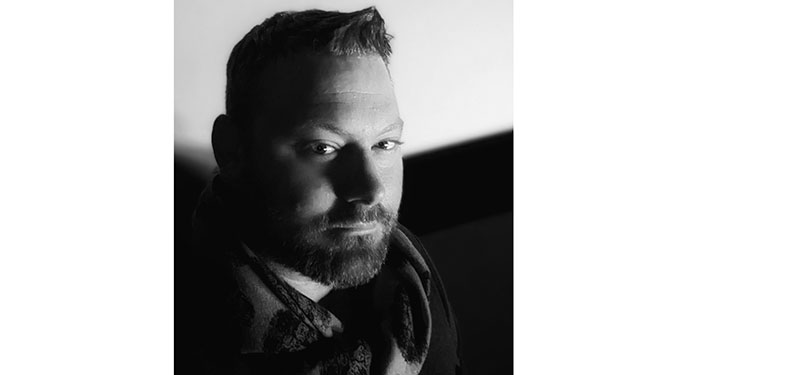
John Daro, Lead DI colourist at Warner Bros, talks about how his mastery over colour transforms, and use of colour to communicate a narrative, bring filmmakers’ visions to life.
Contagion
John Daro is a Lead Digital Intermediate (DI) colourist at Warner Post Production Creative Services, a division of Warner Media. Throughout his career, he has supervised the finishing and grading of feature films, television pilots, commercials and music videos for clients ranging across all of the major studios to independent producers.
His first experience of working in post-production was at FotoKem film lab, where he successfully architected a direct-to-disk dailies pipeline. From that role, he moved on to film scanning-recording and, alongside developments in the DI process, his current position as a finishing colourist. His past jobs had given him a mastery over colour transforms, and he started to combine those strengths with the art of cinematography.
He continued to initiate and develop post-production techniques including 3D conversion and the early days of HDR imaging. As a founding team member of their digital film services department, he helped FotoKem achieve its status as one of the top post houses in the film and television post-production industry.
A Tale of Love and Darkness
His ideas about the job of a colourist and how colour influences an audience’s interpretation of a film have resulted from his experiences of using colour to help communicate a narrative. “In a way, the colour process literally shapes what we want you to see and what we don't. At its most basic, colour finishing is the process of highlighting and subduing certain key areas, which directs viewers’ attention to where the filmmakers intended them to look.”
Communication, Storytelling and Colour
Before digital colour grading, cinematographers highlighted these key areas through shadow, light, depth of field and lens effects. Photochemical timing changes were limited to colour and density. Nowadays, limits have fallen away with the use of shapes, articulate roto masks and matte channels. Ultimately, he believes the end goal of all these tools is not only to make the image feel natural and true to the story but also to highlight key moments that are necessary for the viewer to absorb the supporting narrative.
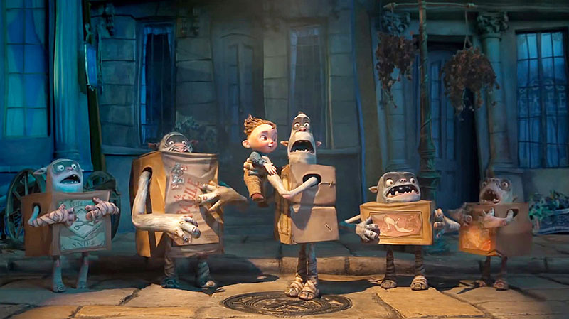
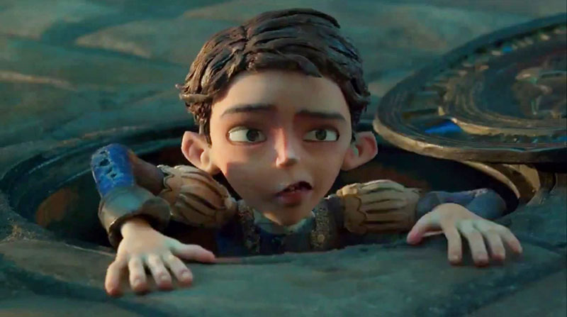
“It's an old cliche but a picture tells a thousand words,” he said. “In terms of communicating more directly with an audience, a couple of examples that pop into my mind involve the use of dynamics to simulate coming out of a bright area. I think I used this technique most effectively in Laika’s The Boxtrolls. When the protagonist Eggs comes out of the sewer for the first time, we applied a dynamic luminance adjustment to simulate what your eyes would do when adjusting to a bright light after a life in darkness.”
Contagion
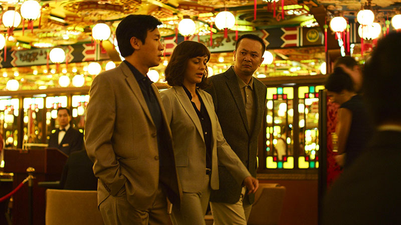
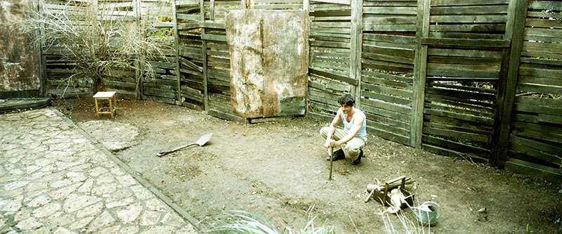
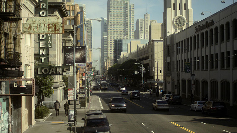
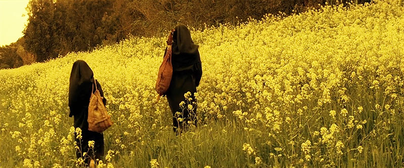
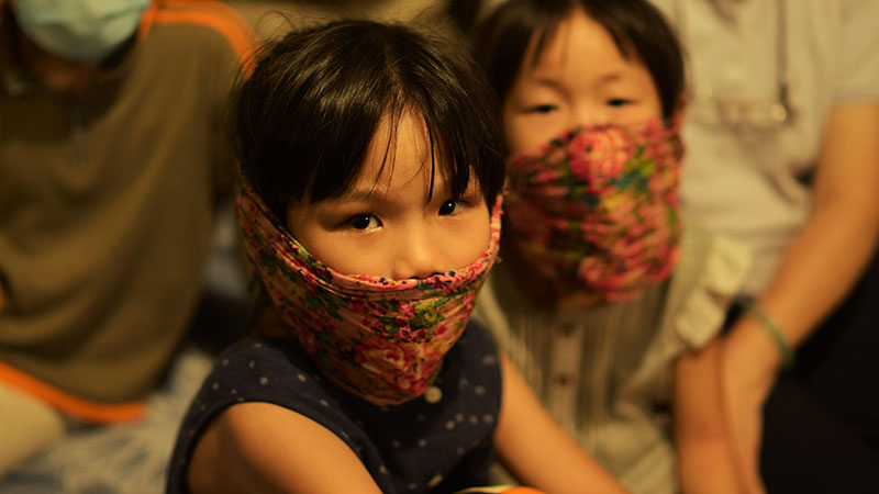
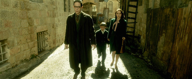
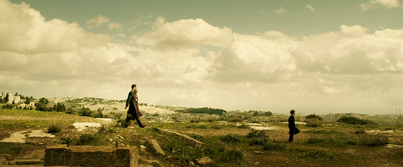
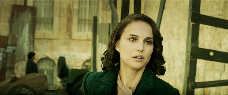
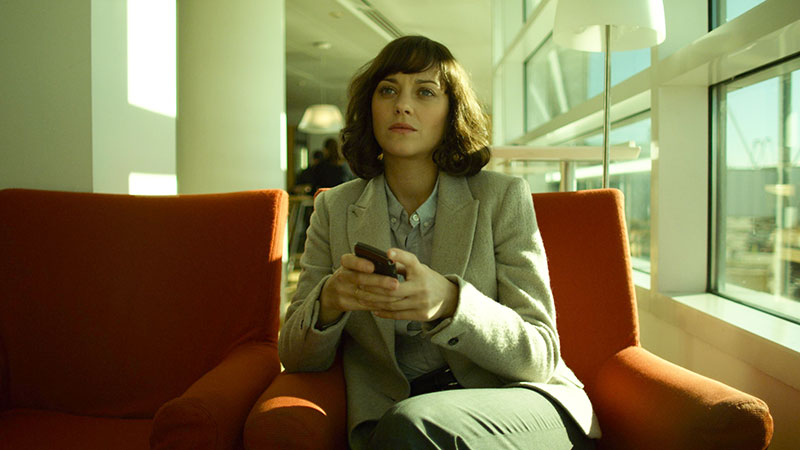
A different example is in Steven Soderbergh's Contagion, where colour choices defined geographical location to help the viewer know where they were at any moment without needing additional information. He used this technique again in Natalie Portman’s adaptation of Amos Oz’s A Tale of Love and Darkness. “For this film, we were dipping through memories and a fantasy world. Colour choices defined the real world versus the world inside the character’s head,” he said.
Many Muses
“So many decisions about a colour palette are decided upfront through lighting, production design and wardrobe. It's always a pleasure when I'm brought in on a project early enough to have been part of those conversations and understand the motivation behind the choices. I feel there's great value for everybody to be on the same page and know how specific colours on set will render in the final output.”
Because look development can have many muses, it’s important to keep members of the production on track. He considers that a style guide, concept art and a deck of references are all great tools for that. He likes to start by picking two or three key colours that are important to the story, symbolise a character or represent a message, and then aims to find the best way to shift and enhance those colours to make a split complementary palette [using a primary with colours adjacent to its complementary colour].
A Tale of Love and Darkness
“In my opinion, contrast and simplicity are at the heart of the finest design,” he remarked. “But I don't think colour is the backbone of emotion in film. I think sound is. Smell would be even more evocative – but luckily for the Jackass movies, smell-o-vision didn't catch on!
“I prefer to grade with the latest audio mix. The sum of all the parts is what makes a great cinematic symphony. Colour and sound must be playing in concert, similar in tone or in contrast but always together. I think that kind of sensory feeling might be ingrained in our DNA.
Clash
“Whenever I hear the opening to Peter and the Wolf, for instance, I visualise the greens of spring. But it doesn't work the other way – I don't hear Peter and the Wolf every time I see green. Colour must be taken in context. Green can make you feel safe and calm the same way a lush field of grass blowing in the wind does. At the same time, it can evoke feelings of jealousy or sickness. It all depends on context and the motivation behind the story being told.”
John Daro, Lead Digital Intermediate colourist, Warner Post Production Creative Services.
Of course, some colour schemes do not ‘work’ – at least, not in an academic sense. Colours clash, certain colour harmonies are not pretty, and it’s important to be able to recognise those mismatches. But John doesn't feel that means you can't use them to good effect, especially if making the viewer uncomfortable or uneasy is what the filmmaker is aiming for.
“Colour is subjective, balance is not,” he said. “Ultimately, the real decision is something you feel in your gut. You know when it’s right. I have an internal rule when taking my passes. The reel is done when I can watch it down and have less than three tweaks to make. You are never really finished. Most often, you just run out of time.”
Building Looks
Achieving a specific look in a film involves working with the director and cinematographer. John approaches the task in stages, first watching a rough cut or reading the script to get an idea of the story. “Next, I take camera tests and start to build a basic look,” he said. “The goal with this first version of the transform is to find something that works for the cinematographer and gets repeated results in different lighting conditions. Obviously, it should also have an aesthetically pleasing visual component.
Contagion
“It's also important when you're building a look to make sure that the camera still behaves as expected regarding sensitivity and dynamic range. You don’t want to bake anything in that could hamper the original photography. In other words, make sure mid-grey still maps to mid-grey.”
Once they have dailies to work with, the process begins again, when John might produce a second, third or fourth version of the look they are heading for. These go into a stills gallery on a server for remote viewing while the creatives continuously update the conversation forum page with feedback. “I maintain before and afters of all versions to make sure that we are improving and never going backwards creatively. The last step is to ensure that the look works for the story once the film is assembled. Tweaks are made to the show look and certain scenes get special treatments for effect,” he said.
“CDLs (colour descision lists) are another vital part of this process. Grading your dailies is very important for making sure that there are no surprises when everyone gets to the DI theatre. I've had past experiences where producers see something that has the final grade but it's too far of a departure from what the look was in editorial. To combat this reaction, we always want to make sure that the look is consistently maintained from the first shot out of the camera, through to the final finish.”
Contagion
Going for Tone
Setting the tone for a scene goes back to the basics of warmer, colder, brighter or darker colours. As mentioned earlier, choosing a few colours to enhance is essential, and from there you can let the background support that enhancement, whether through a complementary value or by making it recede. John said, “There are also the obvious washes that you can use. For example, you know that if you make a scene very red, then the warmth invokes a sense of romance or love, and can also yield a literally hot vibe.
“In contrast, a very cold, very desaturated look invokes a sense of bleakness or a dystopian feeling. Magenta's a weird one because it can be warm and cold at the same time, depending on on context and how it's used. Green-yellow also functions similarly. It can feel sickly and off, but romantic and warm at the same time, depending on what side of the hue you're on. I don't know where these generalities came from but at this point, they're almost universal.”
A Tale of Love and Darkness
Pipeline
For this critical part of film production, John has found the most important factor is having a colour-managed pipeline to make sure that you’re not harming the pixels. “Never work on what the film looks like, but rather what the film was captured as.,” he advised.
“If you ensure that you’re always working in a photon, real-world, scene-referred way, the displays don’t matter as much. They simply target what you’re trying to hit. They can always be adjusted after the fact if there are technical concerns. I always work with soft display-referred transforms that gradually roll off your highs and also have nice detail in the black. This generally helps cut down on the number of technical issues.
“Beyond that, it's all about keeping your eye on the scopes and making sure that there are no technical glitches in the actual capture or renders such as quantization, dead pixels, hits or bad frames. All it takes is an eye for detail and a great QC department.”
Blurring the Line – Animation and Live Action
The Boxtrolls
From ‘Space Jam’ and ‘The Boxtrolls’ to ‘Tom and Jerry’, John has quite a bit of experience grading animated films. Having compared animation projects with live action films, he believes that at the core, the two are very similar. The same principles that make a strong image still hold true regardless of how the image was created.
“Modern render engines are very good at doing what light does. So much so that a lot of DoP buddies of mine are pre-vizing lighting setups virtually. Nowadays, that line is being blurred even further where some films can be comprised of mostly VFX shots. A lot of these setups, especially with the advent of digital doubles, are not very different than a fully animated picture.
“If we’re defining a ‘live action’ shot as something captured with a camera and no further manipulation, then the biggest difference comes from workflow. For example, if you have a live action setup that has been shot with clouds and maybe some inconsistent lighting situations, your first step is technical colour correction just to balance the shots together. You don't have this problem with animation, but you do have a similar situation where you might have many artists working on the same scene. This can sometimes lead to slight inconsistencies that also need to be smoothed out.”
The Boxtrolls
One major advantage of CG originated shots is that they often have advanced matte channels. These could be as simple as a matte for the main character or as complicated as depth or normals. These additional tools allow for more complex grades, but also increase the time that must be spent on each shot.
Critical Hardware
According to John, his grading suite looks like ‘a hot mess’. “Imagine the Great Wall of monitors,” he said. “I have two Prism x300s, two GUI monitors for Baselight, one extra wide LG for what I call my Swiss Army box and an admin computer. The most important display is my Christie 4K projector. I also have an LG C2 to simulate a consumer experience.
“The most important machine in my tool set is the Swiss Army box. Essentially, it's a Supermicro chassis with four NVIDIA RTX A6000 GPUs that has every single piece of post-production software that has ever been useful. I also use this box for coding and development of my own in-house tools. I would consider this machine mission critical.
A Tale of Love and Darkness
“Second to that, the next most important piece of gear would just be an external scope. Your eyes can lie to you, but scopes never do. Software scopes have made huge advances in recent years. I can't say I use the external one every day, but when you need one, there really isn't a substitute.”
Colour Science and Simplicity
For most jobs, John uses FilmLight Baselight grading software, for straightforward reasons. The first is Baselight’s colour science and second, he appreciates the simplicity of the interface. He said,“When colouring long form, most of what you're doing is manipulating groups of many shots. Baselight makes this very easy to do.
“The other feature I can't live without is the way Baselight organises and categorises. When you get towards the end of the project and things are getting hectic, it's very nice to be able to sort and view in any way that a project demands. Often this has to do with missing visual effects or work that I need to get to after the session is over. I use categories and marks so that I always know what the status of a scene is at any given time.
Contagion
“This organisation also aids in communication. I can always keep post supervisors up to date with reports, and my in-house team always knows what needs to be done and what is already completed based on the organisation that we have put in place. I've always felt that Baselight was built by people who do the job of colour – not by committee or non-practicing theoreticians.”
Coming Up
John has some interesting projects on the horizon, including a docuseries directed by Allen Hughes for FX about Tupac Shakur’s life and his relationship with his mother called ‘Dear Mama’. “The interviews have an exciting cognac look that I can’t wait to share,” he said. “The first part premiered at the Toronto International Film Festival and was very well received.”
He’ll soon finish a feature called ‘Sweetwater’, the story of the first black NBA player, Nat ‘Sweetwater’ Clifton. “It is a period piece, which means a lot of fun in the colour department. We contemplated a black-and-white [Kodak] Double X film look for the show but ultimately landed on a derivative of an Ektachrome simulation that I had built a while ago. It has a super cool look, if I do say so myself,” said John.
A Tale of Love and Darkness
“We are also supporting pre-production and dailies on ‘The Gun on Second Street’. This show is shooting on film, which is always pleasurable and exciting. The look for the show is a straightforward Kodak film vibe, expertly shot by Leo Hinstin.
I’m also supervising the remastering of ‘Superman II’ – both cuts – to be released in early 2023, just in time to get people excited about Michael Shannon’s General Zod in ‘The Flash’. My team and I will also return to animation early next year for an upcoming Netflix feature. www.filmlight.ltd.uk
Contagion
Contagion


