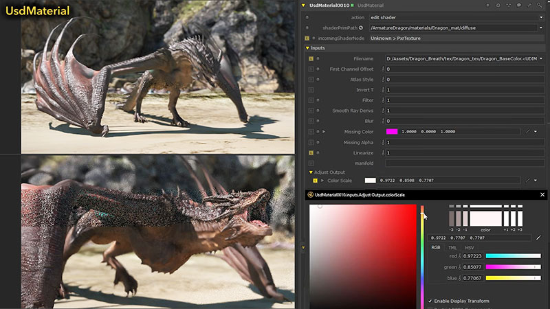
The winners of the 2023 FilmLight Colour Awards talk about their projects and their very different creative and practical approaches to colour grading.

When the winners of the 2023 FilmLight Colour Awards were announced live from EnergaCAMERIMAGE 2023 in November, they took part in a panel discussion where they talked about their projects, techniques and experiences.
Looking across the different categories of the competition, their discussion shows the differences in grading for the different project types – feature film, TV series, commercial, music video and low budget feature – as well as the differences in these individual artists’ approach to grading.
The winners were selected by a jury of independent cinematographers, directors, colourists and creatives.
How Barbie Changed Everything
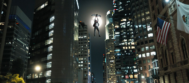
The award for the grading of a theatrical feature went to colourist Yvan Lucas at Company 3 for his work on Barbie. Starting out as a photochemical colour timer in France, Yvan was among the first colourists in Europe to digitally grade feature films using digital techniques. Despite his long career and experience on many well known films, he had never submitted his work to any jury before entering Barbie in the Colour Awards.
“Without meaning to seem uninterested, I was quite content to remain in the shadow of the director of photography,” Lucas said. “However, this movie changed everything. Everyone was talking about the film’s colours, and I thought this incredible journey was something that should be shared.”

To create the perfect ‘BarbieLand look’, Lucas worked with director Greta Gerwig and cinematographer Rodrigo Prieto, creating a LUT at Company 3 ahead of the shoot using The Umbrellas of Cherbourg, a Jacques Demy film from 1964, as one of several visual references. For Greta, it was important that the skin tones in ‘BarbieLand’ were pastel and not too saturated, but everything else about the shots needed to be full of pinks, turquoises and other colours that would eventually help define the film's unique look.
Lucas described the extended LUT development process. “We wanted everyone who saw the rushes to have an idea of where the colours would end up in the final film,” he said. “The LUT we developed would allow me to grab hold of specific hues and drive them towards the BarbieLand colours. Then this was combined in part with a second LUT based on the old three-strip Technicolor process and finally a third, based on Kodak film negative, even though Rodrigo shot digitally. By grading through these LUTs, we were able to bring out those BarbieLand colours in a very special way.”
One of the key challenges for Lucas when in developing this LUT was to achieve the vivid colours of BarbieLand – the pinks, reds and blues – while keeping the skin tones pastel. “Usually, when you change colour," he noted, "you use a hue shift adjustment and push the reds, yellows and so on. You can make everything more saturated. The problem is that when you select a certain hue, you'll often also be grabbing onto some of the skin tones as well.
“For this film, we asked a friend skilled in this kind of work to create a special plug-in that allowed us to move the colour in the direction we wanted. In our case, we could push the reds, blues and pinks without affecting skin tones at all. Since that time, the major colour correctors have similar tools but at that time, it was this plug-in that enabled us to be so specific with our BarbieLand LUT.”
The scenes on Venice Beach also challenged Lucas. Due to California's famous ‘June gloom’, the production had to shoot in overcast weather conditions. In among the vivid colours of BarbieLand, the scenes appeared somewhat dull and lacking in colour. “We had to work with a lot of secondary adjustments – mainly keyers – to essentially 'repaint' that scene,” Lucas said.
The Pimp: No F***ing Fairytale (OT: Luden) – A Rare Combination
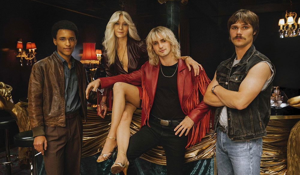
Turning away from pink perfection, freelance colourist Dirk Meier won the award for the grading of a TV series / episodic for his work at D-Facto Motion on season one of The Pimp: No F***ing Fairytale (OT: Luden). He knew this was the right project to enter for the FilmLight Colour Awards, as all the elements of storytelling came together so well, allowing him to push the look and colour in the grading suite.

“The story, which is set in the early 1980s around Hamburg’s red-light district, demanded a strong visual style and was supported by great production design, costumes and make-up, a very talented DoP, skillful lighting, directing and brilliant performances depicting very ambiguous characters. As this combination is quite rare, I was certain this must be the project to submit,” he said.
Cinematographer Tim Kuhn (who was the DoP on last year’s Spotlight category winner) contacted Dirk four months before the start of principal photography. During preproduction, Dirk read the scripts and discussed the visuals with Kuhn. They then went on to carry out hair and make-up, costume, lens and look tests, which in Germany are seldom taken to such a deep level.
“This was an extremely singular and rewarding moment for me, to have the production designer, gaffer, heads of costume and make-up, the two directors, and a producer next to the DoP in my grading suite to show and discuss our look tests,” Dirk said.
Dirk and Tim found inspiration for the look in a music video that used documentary footage from a sequence of the 1962 movie, Mondo Cane, shot in the red-light district around the Reeperbahn street in Hamburg. Dirk developed a highly textured look with a dark, moody atmosphere. Especially in the HDR version, he worked with the extended range of contrast and wider colour palette to create a period feeling with lifted black levels, while ensuring the 1980s neon lights stood out.
This was only Dirk’s second episodic project, so one of the key challenges for him was the length of time spent on the one project, which was approximately seven weeks. “I had never before had the commissioning editor and showrunner, who were regularly checking the grade, ask for it to look even darker and grittier. The DoP and I were initially more careful, but we were happy to embrace that direction,” he said. In the final grade, he explored tools to enhance the patina of the sets, distortion and bokeh of the lenses, and added grain and frequency-based contrast.
At the awards ceremony, Dirk urged more colourists to attend Camerimage. He said, “I encourage all colourists out there, come to Camerimage – it’s a great place and a great festival and I would love to strengthen the collaboration between the colourist and the cinematographer even more.”
Zara Man, ‘SS23’ Behind the Smoke Screen
Tim Masick at Company 3 received the award for the grading of a commercial for his work on Zara Man, ‘SS23’.
Tim, who also won the commercial category in 2021, worked with director Fabien Baron and DoP Philippe Le Sourd to create a fantasy dream world where the elements are subtly dramatised – recreating in turn the mood and imagery of Red Desert (1964, Antonioni), Paris, Texas (1984, Wenders) and photographer Todd Hido.
“I have been fortunate to work with Fabien Baron for more than 20 years. His taste and creativity have influenced how I see things more than anyone in my career. With each project, I eagerly look forward to seeing what world he has created,” Tim said.
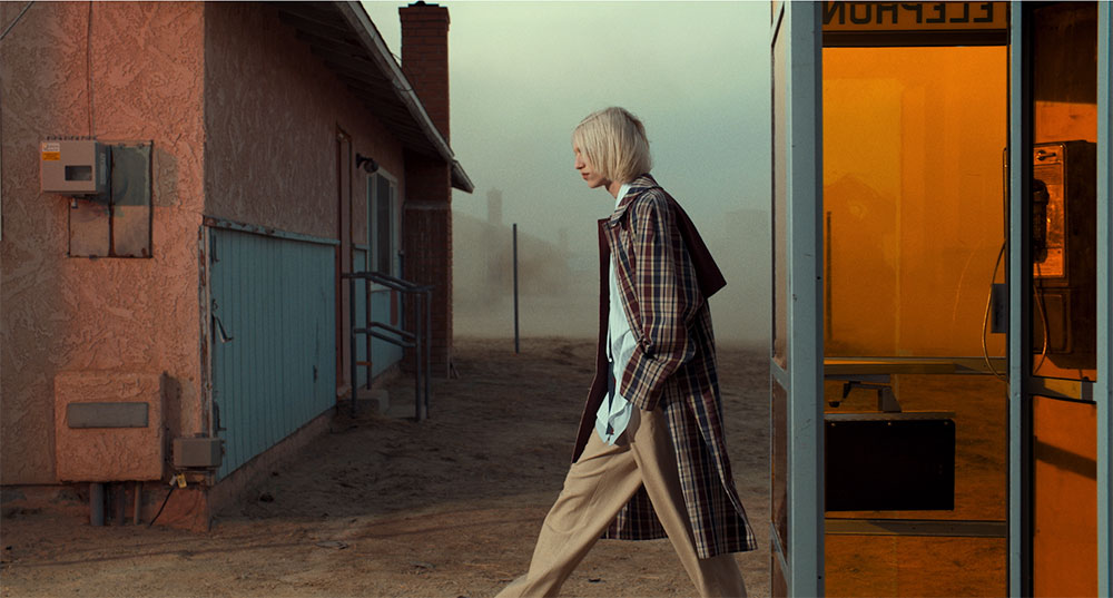
Because of this strong history, he was able to complete a version based on the mood of the piece, and presented it to Fabien. They refined it and came back to it the following day to make sure that they still liked it – adjusting a few things until they felt everything was as it should be. “The look we settled on doesn’t impose too much on the film. Instead, it heightens the elements that were designed and captured. Appropriate exaggeration and restraint add to the tension of the piece,” Tim said.
A part of the grade he found especially challenging was maintaining the smoke colour between the different scenes. “I believe it was a one-day shoot, so time of day and the density of the smoke varied from scene to scene,” he said. “Giving a nice shape and contrast to the skies was also a priority and took time to finesse.”
Horra by Mayyas Choreography in Colour
The award for the grading of a music video went to freelance colourist Marina Starke for her work on ‘Horra’ by the dance group Mayyas. Horra was directed by the group’s choreographer, Nadim Cherfan, and shot by cinematographer Shadi Chaaban, who Marina worked with to create the moody, mysterious, bold aesthetic that they wanted to achieve.
It was important for both Marina and Shadi that each dancer should stand out in equal measure without losing the cinematic touch and the play with light and shadow. There were no visual guides or references used, either. Instead, the two relied on each other’s vision and judgement, and shared their progress with the director, Nadim Cherfan.
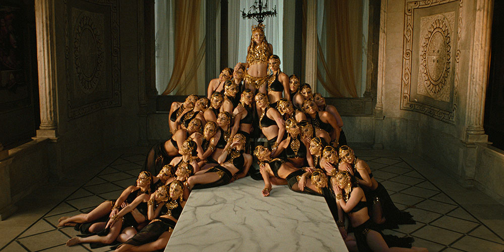
“Because Nadim is a choreographer, he looks at the image more like a stage – a little bit different from the usual film director,” Marina said. “It was an important perspective, and we went back and forth a little on some of the scenes. In the ‘Tree of Life’ scene, for example, Nadim had imagined the costumes the women are wearing to look like skin. We went for a warmer look at the beginning, but it didn’t really make them stand out, so we pushed it more towards blue which made them light up like a diamond. Then we added the sparkles and really made them glow.”
Possession in a Nordic Landscape
The Spotlight award, which showcases the craft that contributes to the creative impact of a low budget feature, was awarded to freelance colourist Cem Ozkilicci for his work at Uhoert on Possession.
Inspired by Scandinavian romantic and landscape painters, Cem completed the grade over 10 days. Working with director Henrik Martin Dahlsbakken and cinematographer Oskar Dahlsbakken, they created a nostalgic look with a distinctive patina, achieved through a combination of lenses and sharpening techniques in the grade.
Cem chose to enter this project because he felt all elements of the film came together beautifully – from the choice of lenses by DoP Oskar Dahlsbakken, the unique location and light in northern Norway, through to the work of the art department.
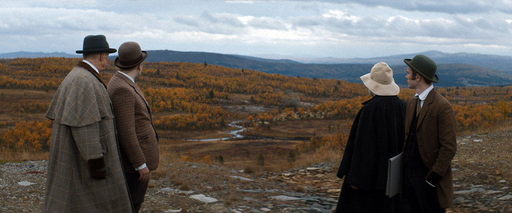
“I felt Possession had a visual quality and character that was worth sharing,” he said. He had worked with Henrik and Oskar Dahlsbakken on previous projects, and though on Possession they weren’t able to create a show LUT due to uncertainties concerning the budget and scheduling, their collaboration was nevertheless very successful.
Cem said, “After going over the references and exchanging thoughts, we started grading with Henrik and Oskar after edit lock. Most of the grade was done in collaboration with Oskar the DoP, combined with a couple of review sessions with Henrik. As a colourist, I find working with these two filmmakers very easy due to the great chemistry they have with each other.”
The main reference was the film There Will Be Blood by Paul Thomas Anderson. The idea was to give it a similar feel, but with a bit more of a ‘Nordic’ quality.
“It was also very much about adding as much production value as possible,” said Cem. “We wanted to accentuate the Nordic landscape without going overboard, and keep the palette more subdued. We looked at a lot of Norwegian painters from the 19th century. We went through the works of Norwegian romantic painter Johan Christian Dahl as well as other Scandinavian and Russian landscape painters.”
The grade supported the storyline by aligning the image with the references, which were from a similar era, and giving it the nostalgic feeling they wanted to create. Cem said, “The story has an element of the supernatural as well as realism due to the fact that it took place during the Spanish flu pandemic. We had to keep a fine balance between making it gritty, yet not too forced or stylised.”
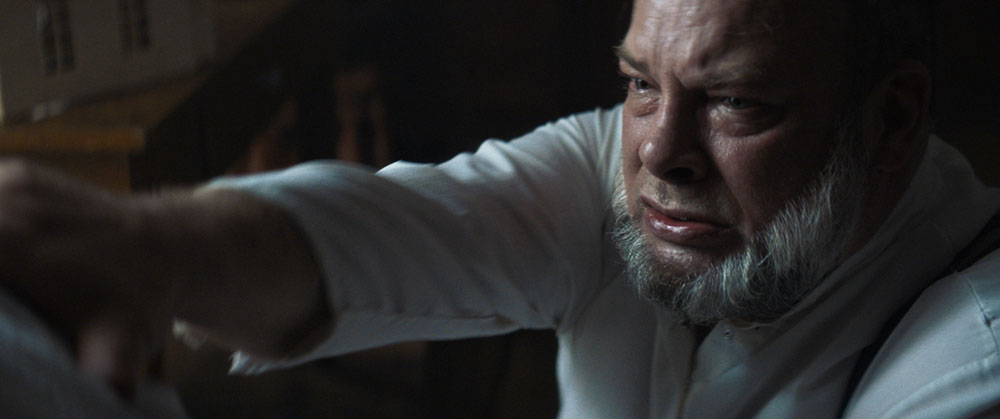
Cem encountered very few challenges in the grade but, owing to the lenses, the most difficult task was finding the appropriate texture per focal length in certain instances and keeping the image on the edge of darkness.
“Also, without a LUT, getting used to the way the dailies looked could have been a big challenge for both Oskar and Henrik. They may not have had the space creatively for a new visual direction. But thankfully, they were open minded and embraced the idea of using our references as a way to build a look that suited the story and mood.”
FilmLight Colour Awards
The Colour Awards are organised by FilmLight in conjunction with EnergaCAMERIMAGE, and are supported by the ASC (The American Society of Cinematographers), the BSC (British Society of Cinematographers), the AFC (The French Society of Cinematographers), CSI (Colorist Society International), CNSC (Chinese Society of Cinematographers), Imago (the International Federation of Cinematographers), the Polish Society of Cinematographers (PSC) and other international groups. www.filmlight.ltd.uk


