


Supervising Colourist Peter Doyle talks about working through the very technical, expressive colour grade for new film ‘The Tragedy of Macbeth’, finished in black-and-white on Baselight.
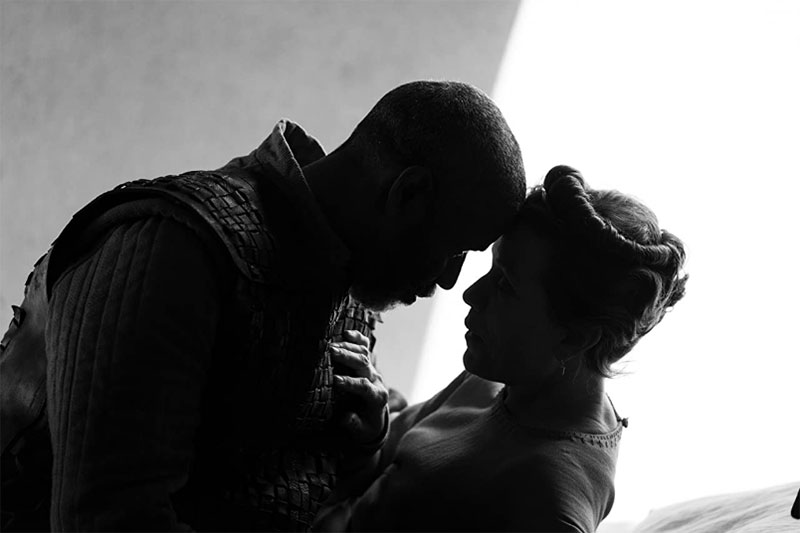
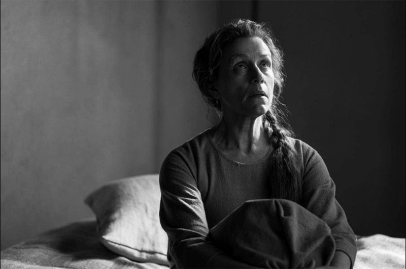
The Tragedy of Macbeth was directed by Joel Coen as his first solo project, with cinematography by Bruno Delbonnel, ASC, AFC. Based on Shakespeare’s play Macbeth, a story of treachery and betrayal, critics have praised the film for direction, cinematography and acting performances.
Supervising Colourist Peter Doyle has previously worked on two features with the Coen brothers. Working this time with Joel involved a similar process, but the capture method was different. “’Inside Llewyn Davis’ was shot on film, ‘The Ballad of Buster Scruggs’ was captured on the ARRI ALEXA and ‘The Tragedy of Macbeth’ was shot on ARRI LF,” he said. “The mix of locations and sets was very different each time, as well.”
The ARRI LF large-format camera system consists of the ALEXA LF camera, ARRI Signature Prime and Zoom lenses, LPL lens mount and PL-to-LPL Adapter. Its sensor is slightly larger than full frame, and the ALEXA LF camera records native 4.5K.
All About the Greyscale
“Joel had made the decision to shoot in black-and-white while he was working on the adaptation of the play,” said Peter. “As a director, he is extremely gracious in explaining the story and the beats of a film - descriptive rather than prescriptive, occasionally supplying specific notes, but typically asking us what we could do with the grade to help drive the story. Bruno Delbonnel, however, is more expressive when describing his concepts for light. His most-used word was grey – it was all about reproducing a grey scale.
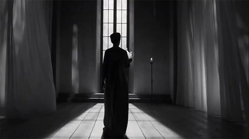
“The film references we discussed were Carl Theodor Dreyer’s The Passion of Joan of Arc, Charles Laughton’s The Night of the Hunter and David Lean’s Oliver Twist. Most discussions, when not about the characters and the film, were about architects working with minimalism such as Tadao Ando and Shigeru Ban, and artists who work with light, for example, James Turrell and Robert Irwin.”
“While some aspects of the film are highly theatrical, it is still a Joel Coen film,” Peter remarked. “We approached the grade exactly as we approached his previous movies, possibly allowing us more room to add painted shadows, and to modulate density changes.”
During the preparation stage, Peter remembers the words used most frequently were ‘stark’ and ‘minimal’. He translated that description as “no film grain, no flares, no retro artifice – which was somewhat counter to expectations given that the film would have a 1.33 (4:3) aspect ratio and black-and-white presentation.”
Setting Up Test Shoots
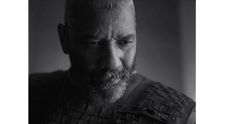
He said, “I got involved once Bruno came on board. We went into the film planning to use the ARRI B&W sensor, but the need for blue screen forced the move to the ARRI colour sensor instead. Although the purity of a true B&W originated image was appealing, I was concerned that Bruno and Joel would be locked into how the sensor would render the skintones. It was also likely that any changes to the image other than tone scale would require roto, which for me worked against the emphasis on stark and minimal.”
To prepare, he set up his own test shoots with black- and white-skinned models – representative of the film’s cast – using matching Phase One achromatic and tricolor medium format digital camera backs using UV, IR and normal light. By working through a comprehensive range of classic B&W filters, he soon understood what would be needed to match a colour sensor to a B&W filtered capture, and was able to establish a language and a reference that he and Bruno could use during the grade.
Peter said, “It may seem obvious, but achromatic DCI projection or streaming – that is, limited to grey, black and white – isn’t possible. Ultimately, we simply delivered a very desaturated file, meaning it became all about managing white points. Using the mastering colour space and white points, we were able to maintain the same B&W across the DCI-P3 D60 white for DCI, D65 white for HDR and D65 for Dolby Vision laser projection.
Perceptual Colour Space
“By moving on to FilmLight Baselight 5.3 we were able to remove all use of LUTS from the pipeline – the software’s Base Grade works the same way in all colour spaces and always feels the same for the colourist, for any camera. Doing this gave an amazing, almost 3D quality to the image. We were able to completely control the coldness or warmth of the B&W and even modulate the colour temperature across scenes. It’s extremely subtle, but we made interiors cold and day exteriors warm, all still visualised as B&W.”
To convert colour to B&W, Peter decided to use a perceptual colour space, which can be useful for particular image processing applications, and one of these is changing an image to greyscale, while preserving the perceived lightness. He asked Eric Horwitz at PostWorks NYC to build Björn Ottosson’s Oklab as a shader for Baselight.
“This allowed us to move the contrast filters that Bruno would have used in front of the lens, to an emulation in the grade post shoot. We built a custom ‘button’ that allowed us to fade from ghostly infrared-style B&W, straight to vintage tintype photography style,” said Peter.
Going On-set
On set, Bruno shot all scenes using ARRI LF at 3200K, but had all the moving lights rated at 6000K. This meant the light was saturated with blue, which helped them to further modulate and control it when adjusting the blue layer in the grade.
Fog and smoke were used throughout the film as a device to fade between scenes, and also to reveal characters, for example, the story’s three witches. To control and balance this effect, Peter’s colour team agreed with VFX to deliver images as multichannel EXR files with up to four layers of fog. The fog was partially shot on set, and the final look was created in post by the VFX Supervisor Alex Lemke.
In the end, monitoring was the most challenging aspect of this project. The projectors at the various premiere events were all different and made monitoring some of the scenes with low contrast grey extremely difficult.
They needed to closely manage the shading of the xenon projector, the banding of the x310 and the metamerism occuring in the laser projection. Metamerism, especially common in neutral colours like grey, is when two colours appear to match under one lighting condition, but not when the light changes. Peter said, “We had to manually tweak the laser projection used for the BFI London premiere to match the xenon projector for the NYFF premiere." www.filmlight.ltd.uk