
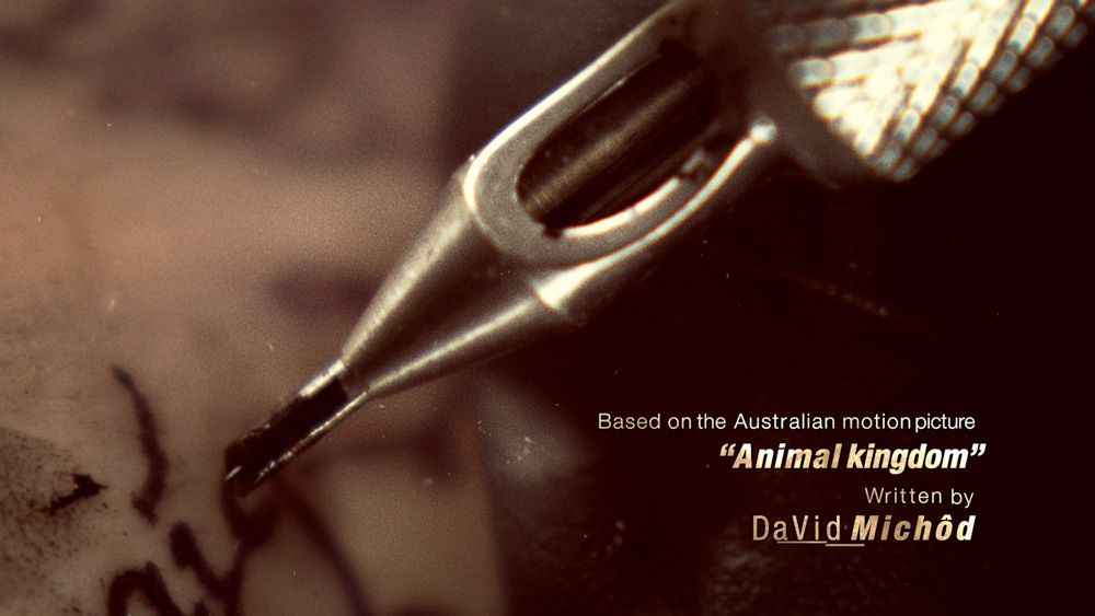
Sarofsky Goes Wild on ‘Animal Kingdom’ Main Title
Production and design company Sarofsky has created the main title sequence for the new US family crime drama ‘Animal Kingdom’ for TNT, which debuted in mid-June. Five years earlier, designer and director Erin Sarofsky and her team designed the award-winning main titles for Showtime's ‘Shameless’ in 2011 but since then, Sarofsky has designed and produced titles for four Marvel blockbuster movies in the past four years. With this new project, they have returned their stylish storytelling to television.
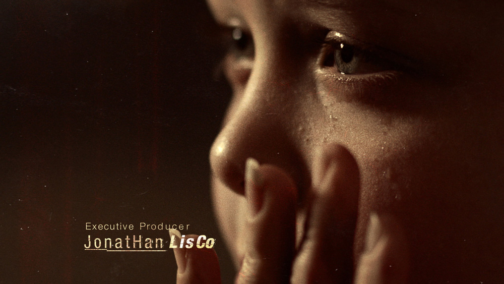
Titles for ‘Shameless’ and ‘Animal Kingdom’ called for contrasting treatments. ‘Shameless’ is raucous and funny, and the titles tell a specific story about the individual characters. The ‘Animal Kingdom’ main title is darker, dangerous and prepares the audience for the violent, amoral world the story’s family inhabits.
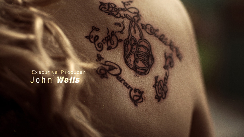
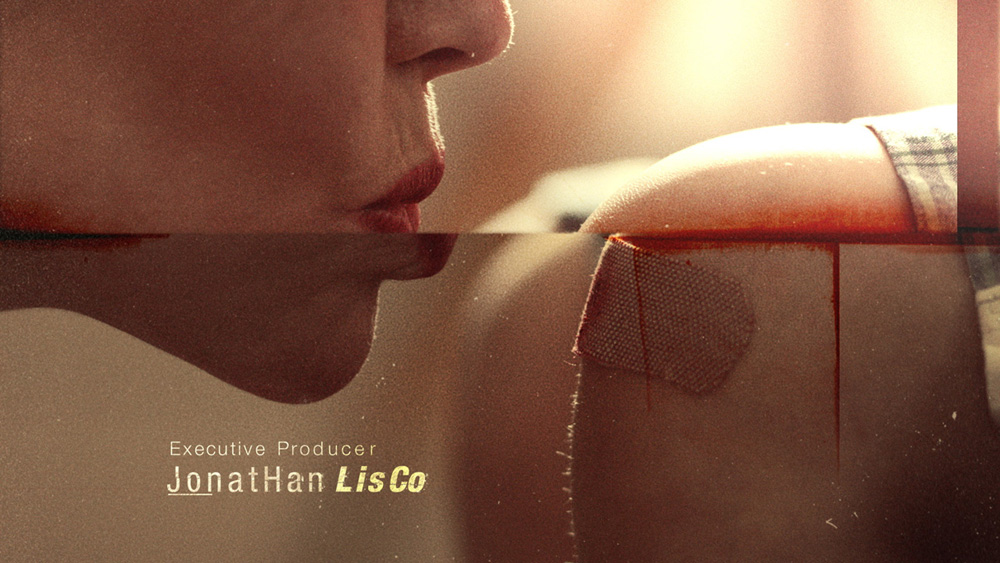
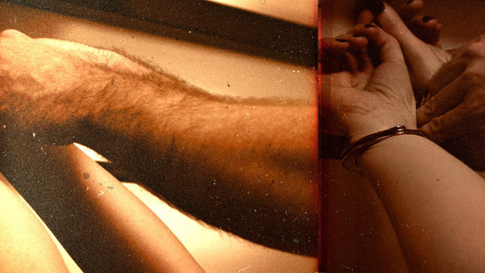
Erin and her team had 60 seconds to visualise the family’s story and unsettling relationships. Macro photography of a tattoo artist at work – recalling the mother’s distinctive tatoo – is intercut with fragmented scenes that take viewers through her sons’ childhoods and onward, into their harsher adult lives. Visual transitions are achieved with abrupt, stuttering visual effects and shifting on-screen type, expressing toughness and tension. Like a memory, the narrative is non-linear.
Awesome Tattoos
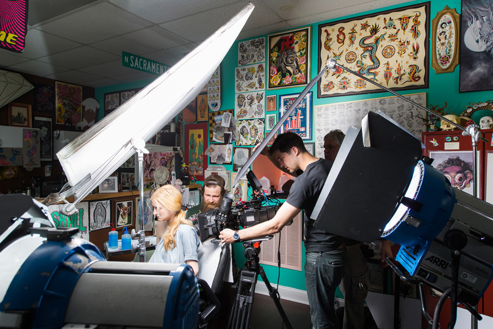
Except for surfing footage supplied from the production, the Sarofsky team of 30, led by Erin, co-director and lead artist Duarte Elvas, and DP Michael Bove, began by organizing photo shoots in Miami, Los Angeles and their home city Chicago. Capturing everything on their shot list took a total of seven days of production, shot over about a month, and resulted in nearly 20 hours of original footage.
Erin described the process of getting everything they wanted as a puzzle. The tattoo sequence, for example, was shot a local Chicago tattoo shop, where the proprietor performed his artistry on-camera on an extra who agreed to be tattooed for the project. Props ranged from a fishing hook, handcuffs, road flares and red ice blocks to a Ducati.
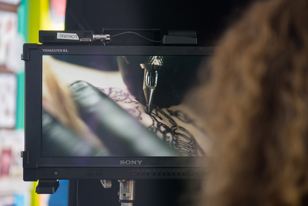
"We used various cameras on this project, and each served a specific purpose," said DP Mike Bove. “For the tattooing sequence, we used a Phantom Flex4k with Cooke S4 prime lenses, plus diopters for the macro details. The diopter filters act as a magnifying glass and allow you to get macro shots from non-macro lenses that would be unable to achieve otherwise. Due to our budget, it was prudent to use a diopter instead of renting specialty lenses to get the very close angles of the needle interacting with the skin. It captured a perspective rarely seen before - even the tattoo artist was in awe.”
Intense Photography
Shooting in 4K for post flexibility, they went for the highest frame rate the Phantom could reach - 938fps. "Shooting high speed is always fun no matter the subject, but it was particularly intense to see the needle going in and out of the skin and the ripples it produced," Mike said. "It fit very well with the creative tone we were going for.”
For various POV sequences, like riding a motorcycle through traffic in LA and getting rough on a basketball court in Miami, the team used a Sony A7r II and a Canon C300 Mark II, the latter with Zeiss CP2 primes. For everything else, an ARRI Alexa with the same Cooke S4 primes was the combination Mike preferred, for the Alexa’s cinematic motion and the skin tones from the Cooke lenses.
He lit every scene in a way to give the team complete control over the footage in post. It was more about exposing scenes properly than establishing a look in camera. Erin said, “When creating a main title, we never know exactly how far we want to push the look, so it’s important to have great looking footage to start with. Then in post, we can dial in the treatment just as we want it. In this case specifically, we could determine exactly how much to degrade the footage. For the high speed tattoo imagery especially, we had to throw a lot of light at it.”
Editorial Puzzle
With 20 hours of footage to narrow down to 60 seconds, organization was the key to this project for editor Josh Bodnar. “Since the production was over a month in duration and in several locations across the US, my assistants organized by shoot day, then by location and then by set-up,” he said. “We had a meticulous structure on Final Cut Pro that we created specifically for this job. All footage was ingested in small portions over that month and organised into a manageable state for screening.
“Mixed footage can be a blessing and a curse. In this case, it was a blessing, and added to the feeling of depth of time and longevity. It helped tell the story of old and new, and the graphic armature that was applied to the final footage also added to the storytelling. It’s design-driven storytelling - the best kind.” The titles sound track comes from Academy Award-winning composer and audio engineer Atticus Ross. In this case the producers worked between Atticus and Sarofsky to make certain that the music and visuals were in sync.
“Editing is, in the simplest terms, putting a puzzle together. Some pieces fit well, others don’t play nicely together,” Josh said. “During this puzzle building process, you find ways of manipulating the footage to do what you want. And while you play and push the footage around, you begin to develop a style and a cadence. Sometimes it works and feels good, other times it needs more manipulation. It’s never easy, and when it looks easy, it was actually hard.”
Staccato Stumble
Combined with Josh’s choppy editing style, the footage and type treatments create an intentional, staccato effect. The effects team applied a grainy, ‘stumble' effect to the video, a combination of techniques that helps transition from the tattoo world to the future and the past, and convey feelings of danger and menace. A coarse film grain was applied to the images using the Rgrain 8mm pack, and photocopy textures added grittiness to some frames.
For this design treatment, a heavy colour grade was added to the DP's polished, cleanly lit video along with the grain, producing a stylized look. Duarte Elvas said, “It was different from the look of the show, while conveying a lot of the same feelings. From there, we wanted to visually separate the tattoo footage from the flashbacks and flash-forwards, so we kept the former cleaner and the latter heavily treated and deconstructed.”
Duarte Elvas described their dynamic stumbling effect seen during shot transitions. “We used Adobe After Effects to deconstruct the frames, creating asymmetrical, unsettling compositions. We wanted the flash frames to feel loose, organic and never obvious or too literal. This was also a great opportunity to create a style and visual rhythm that fit the soundtrack and the show perfectly.
Deconstruction
“We also focused on the deconstruction of Helvetica, which is a very clean, modern typeface. Drawing inspiration from the 1990s deconstructed design, specifically in those surfer magazines and Ray Gun, seemed appropriate. It was an interesting challenge to push the deconstruction as much as we could while still keeping the names legible for the legally required time. Domico Watson was the artist who used After Effects to animate the type and Tnaya Witmer was responsible for treating the titles to integrate well in each shot.”
Erin noted that a certain amount of visual effects work was needed to make the macro tattooing footage look flawless. Working in Flame, VFX artist Cory Davis was instrumental in making it look as if the model in the tattoo shop was getting the same tattoo the character has in the show. “That meant concealing the actual tattoo the artist was applying in some shots. At other times a tattoo needle had to be added to the shots, to simulate the tattoo being inked. All of this work helped sell the effect tremendously,” Erin said.
“Also, some of the shots revealed sterile plastic that wasn’t typical of tattoo machines in the ‘80s. Cory rotoscoped and digitally painted out any such inconsistencies. We really wanted to make sure the tattoo process looked exactly right, and first created style frames that the clients signed off on. Those were used as reference as we put the treatment onto the footage.” sarofsky.com


