For Channel 4’s new Formula 1 deal, the Design Studio at Framestore 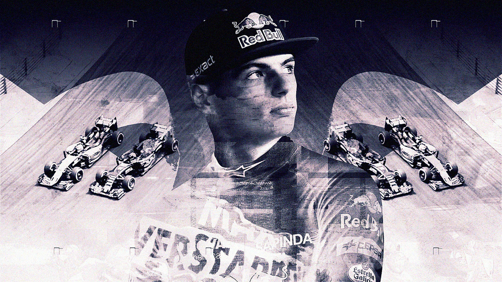
left traditional ideas about racing broadcast titles in the dust - but kept
the speed, glamour and intense competition of F1.
Framestore Races to the Finish for Channel 4’s F1 Coverage

Channel 4’s broadcast of the 2016 Formula 1 Rolex Australian Grand Prix on the weekend of 19-20 March marked the introduction of a new fast-paced title sequence created for the channel by the Design Studio at Framestore and Whisper Films.
Channel 4 is the new terrestrial TV home of F1, and this broadcast was the first within their three-year deal with Formula One World Championship Limited. The new 50-second title sequence will introduce live coverage of ten international Grand Prix events plus extensive highlights of all 21 races each season.
F1 Shake-Up
For the Design Studio at Framestore, the brief was an opportunity to shake up traditional ideas about intros, openers and titles for Formula 1 coverage - without losing the sport’s sense speed, thrills, intense competition and glamour.
Co-Directors Sharon Lock and Ian Spendloff worked with Whisper Films to create the piece, and decided to find their inspiration outside the sports world, looking at top-level title sequence design for film, drama and television. After all, Framestore has its own history of working on title sequence design. Their Film and Integrated Advertising divisions created the opening sequences to six James Bond films including the most recent, ‘Spectre’. The Design Studio itself concepted and executed titles for the documentary ‘We Steal Secrets: The Story of Wikileaks’, directed by Alex Gibney in 2013.
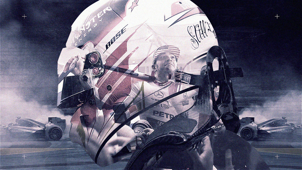
Although Whisper Films actually had presented the team with decades of archive racing footage, plus still images, as raw material, instead of the usual edit of well-known racing moments, Framestore’s artists used mirrored and layered elements and imagery to create a very stylised look. Footage was combined with detailed graphic overlays to create a string of small vignettes, which transition together in an uninterrupted rush to the finish. Manually crafted glitches convey the intense speed and energy of the sport, with strong, bold typography introducing the location of each race.
At the Start Line
Sharon and Ian said their biggest challenge came in knowing where to start. Their formula was design, plus history, plus a strong racing aesthetic. Ian said, “Because the final output was to be in HD, we favoured the post-1980 video to work with, and wanted to make it driver-centric, emphasizing contemporary drivers. We carried out some animation tests combining stills with video, and let the audio track – instumentals from Fleetwood Mac’s ‘The Chain’ - influence the style and approach as well.”
"At this stage, the designers were working with the editors, who made an initial cut of the selected material, then the two teams worked back and forth to achieve the right mix,” said Sharon, “while two After Effects artists were on the actual production. After producing a series of style frames in Photoshop, we moved into experimentation in After Effects, which revealed many options and remained the only software we needed on the project.”
Real Speed
The foundation of the layering is stills images superimposed with video. “We avoided making cutouts as we didn’t want a chopped look,” she said. “We were looking for a feeling of realism, not an overly artistic production. So what you are seeing is frames of real video or complete still images. To animate the camera and keep it moving forward, we worked in 2.5D space.”
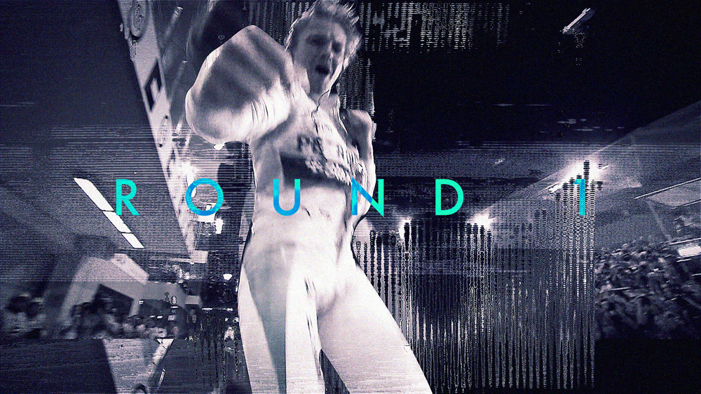
Because that constant sensation of forward motion at speed - zooming along, in fact – is an essential theme, mirroring the video on a central point is another recurring technique. At some moments, video clips were chosen in which the camera looks down the track over the bonnet of the race car, from roughly the driver’s POV.
When it came to effects, no presets or effects plugins such as lens flares were used. The artists borrowed from an elements library, or manually emphasized looks that existed in the video. The video glitches were ‘real’, introduced manually by displacing the images, and added at expected spots such as impacts, instead of randomly. “The fluid transitions, which are also critical to keep up the pace, were created as we progressed, taking the renders from shots to create new storyboards and working back toward the point where a transition should happen,” said Ian.
Form and Colour
The sequence’s dark, thundery, textured look appealed to the client more than some of the more colourful options the design team experimented with. They chose a cooler blue-black tone instead of straight black/white.
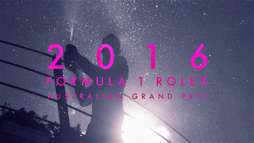
The font of the text elements is Futura. At first, they tried some smaller typography but found it looked too technical and static against the fast moving visuals. Choosing a bigger more graphic font, they took advantage of its simple design to hand animate the stylish way it breaks apart and reforms to deliver the message of venue, round and race.
That brilliant pink is a happy accident, however. Sharon was using it while she experimented with the text looks and animation, and when the client happened to see it, they liked it immediately. www.framestore.com


