

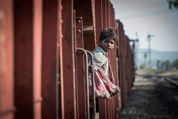
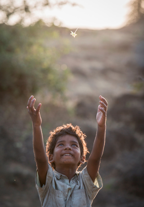
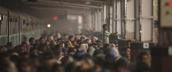
DI Colourist Olivier Fontenay’s most recent feature film project is ‘Lion’, a romance in which the story unfolds in many different settings, environments and cultures. It begins with a five-year-old boy, lost in the streets of Calcutta far from home, who is transported to Australia and then undertakes a protracted search for his family 25 years later.
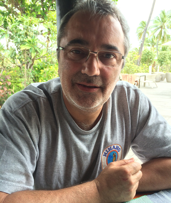
Olivier has worked freelance for the past three years but before this, he spent nearly 15 years at EFILM Australia. “A few years ago I worked with the director of ‘Lion’ Garth Davis on Jane Campion's television series ‘Top of The Lake’ and I was very impressed by his passion and how he believed in getting the details right,” said Olivier. “I had also completed three features before with Greig Fraser, the DP – ‘Killing them Softly’, ‘Last Ride’ and ‘Bright Star’ – so I knew them both. I put my hand up when I heard about ‘Lion’, saying I wanted to work with them again, and they agreed.”
ARRIRAW Files
An experienced Baselight colourist, Olivier completed the DI on ‘Lion’ in 2016. The main camera was the ARRI Alexa, so that his principle work was on the ARRIRAW files, augmented with footage from other cameras on drones. This material combined with visual effects shots resulted in a mix-and-match of resolutions and file formats.
The visual effects were done at Iloura in Melbourne, whose team he was able to work with fairly closely. They took the same RAW files that he and his team were working on, and worked with a graded reference, but then handed ungraded DPX files back to him. This made the process very transparent.
“We set up the Baselight job with one reel per scene and I simply graded the film in the same order in which the story is told. That is, I started at the beginning and finished at the end. The edit didn't change much during the DI because the cut had been very close by the time I started grading. After that, the cut changes were mostly tweaks.
Character Colour
“Not only is there a big time difference in the movie between what happens in India and what happens in Australia but also, of course, the locations are different,” Olivier said. “That affected the visual style but the aim was to make it look very natural while supporting the narrative. The look is there to support the emotion, and in a way, the less aware you are of a specific ‘look’, the better it is.”
He noted that because the focus of the film was on the characters, controlling how they looked in the context of what was happening to them at any stage became one of the main challenges in post, starting with the boy’s story in India. “Furthermore, a lot of the footage was on the edge of exposure and the contrast felt very soft - but in fact it wasn’t too soft or too underexposed. It was a very sensitive area to be in and a very thin line to walk. We were really working in the danger zone.
“That's why I believe Greig Fraser deserved the Oscar nomination and the ASC Award for this film. He was taking a risk – exposing down but not too much, almost to the point where you could see the noise when you were raising the brightness of the image. This meant I could pull the blacks down and really work on them. Although you can't actually see the noise, you can feel that something is there and have the impression that you are seeing film grain. It doesn't look noisy, but it gives the image a special texture and feeling.
Scene to Scene
He used softened shapes in Baselight to separate one part of the image from another in a spontaneous way to give subtle impact to the image. These are quick to use and give a natural result without his having to think consciously about them for too long - important for this project because he was reluctant to allow a machine to separate the images from his emotions.
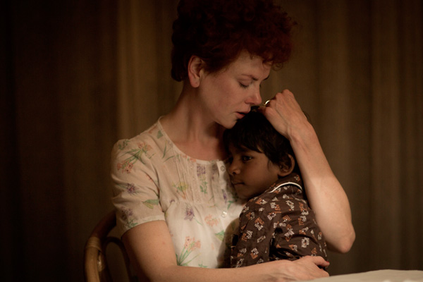
Olivier said, “There isn't really any scene in the movie that wasn’t either enjoyable or challenging. However, in one scene between the lead character and his adoptive mother, he gives her a cuddle. In those shots it was very difficult to make his face just readable enough. I also had to adjust the mother’s hair to make sure that the red was not overpowering.
“Also, when we first see Australia the image has a different feel compared to the contemporary Australia, and those scenes serve as an in-between. They have some of the softness and gentleness of the Indian world but are set in Australia, so you have stronger colours. When you move ahead to the contemporary Australia, it's more muted and normal so you can relate to it.”
Deliverables
“The main deliverable was the P3 grade for cinema, and then we had to replicate that for the video release, which is in a different colour space that goes against that look. Consequently, we spent a fair amount of time making sure that the grade was also right for the different video deliverables. But everything I’ve seen on TV or in print in magazines has been faithful to what we did, so from a colourist's point of view I can see that it did translate very well.
“Interestingly, for the HD version we found that we couldn't quite get it right in the blacks on certain shots, though we spent a fair bit of time on it. So we went back to the P3 and adjusted it in the film grade in order to be able to work accurately in HD, which in the end benefited not only the HD version but the film grade as well.”
Olivier also talked about his general approach to his grading and digital intermediate work. He will typically spend most of his time during the process on setting the initial grade and letting this evolve with the story as it is told, as he did for this project. “I don’t usually rely on secondaries. They come when they are needed. I always try to work with what I have in front of me because I trust that what the DP shot will be good enough to translate to emotion.
“Because I come from the photochemical world of film, I started grading on digital systems using the same concepts of colour, density, contrast and then saturation – I could do a lot with that as a foundation. In Baselight I can work the same way for the film grade to give the base look, but I can also use the video grade tools – lift, gamma, gain – to get to all the little nuances. The video grade is the only way I can lift the blacks a tiny bit without lifting the whole image or losing contrast. Because I like my highlights, being able to separate the blacks, mids and highlights changes everything for me.
Colourist and Machine
“The ability to use the film and video grades in separate layers and move very quickly from one to the other means that I can work with my own style of grading and really free myself from the machine. I can be quite intuitive with what I do and achieve a lot with very little – but when I need to go a bit further, I have all the other tools at hand.
In short, he said, the Baselight makes a colourist feel paradoxically free from the machine. More specifically he commented on the built-in colour management. “To be able to use the machine to just grade and have it do what I want it to do by giving me all the material back in P3 is great. If I’m asked to do a job with a mix of RED and Alexa and Blackmagic and dodgy stock shots, my answer is, “Certainly, whatever!”
“I have to set it up correctly before I start working, but once that’s done I don't have to think further about the camera LUTs. I can just get on with grading. Sometimes I can use an image in a colour space that it was not designed for and still get a lot out of it – it gives me another space in which I can work. In Baselight there is generally a way to do what you want and quite often more than one way, which means that the system can adapt to me and I can concentrate on the image rather than having to deal with the machine.
For me those are the biggest advantages a grading system can give a colourist –flexibility in the colour management plus the ability to adapt it to my way of thinking. www.filmlight.ltd.uk


