
New York studio BLOCK & TACKLE had the exciting job of handling the rebrand for SYFY WIRE, the official news website for SYFY channel that reaches fans of sci-fi, fantasy and horror. The team worked with network executives including SVP Head of Creative Jeff Blackman, VP Design Calvin Chu and Design Director Ariel Frost in an in-depth collaboration.
B&T’s assignment was to reinterpret the SYFY Master Brand into a new visual identity for SYFY WIRE. B&T's Partners and Creative Directors Adam Gault and Ted Kotsaftis devised the motto ‘We're obsessed too’ and drew on aspects of sci-fi, horror and fantasy culture. Recognising the importance of the fans themselves to the brand, they wanted to give the project a fan-made feel, and borrowed looks from classic comics.
Geek Culture
New branding at Comic Con
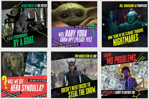
The slightly desaturated colour palette appeals to the fans’ attraction to vintage comic books, for example, which was also a source of fun. For instance, the new SYFY WIRE logo stickers that they developed and placed across assets in a playful syle, was originally inspired by the 'mark of authenticity' stickers placed on collectible comic books. "Our idea was to foster a ‘fan-made' feeling," said Adam. "We were really inspired by the not-too-perfect, homemade feel of cosplay costumes… there's energy, excitement and love in those costumes, and we tried to capture all of that in our designs."
"It was important that the new identity capture the excitement and obsessiveness of geek culture," said Adam. "Working with SYFY’s team, we developed a system that reworked the fonts, graphic devices and colours from the SYFY master brand into a new, more expressive identity for WIRE."
The new brand is certainly distinctive, but Ted said that the identity B&T’s team handed to SYFY is really an ethos. “It is a way of thinking and expressing the passions of genre fandom,” he said. “We supplied tools for creating graphic content but only loose guidelines for how to use them. Designers handling the brand from now on are free to express themselves in whatever way they want. It's been amazing to see how the team at SYFY has been implementing and evolving the designs."
Style Guide
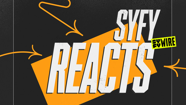
The new system is defined in a style guide that deals with the brand in situations from on-air packaging, website, social and podcast designs to event signage, merchandising and brand awareness. B&T's deliverables also included six animated packages for SYFY WIRE's franchise shows, a generic toolkit for future properties and other applications.
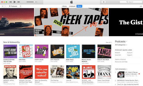
SYFY WIRE on Instagram
“A style guide helps ensure consistency of the brand identity when creating new materials. Most style guides would include clear rules for logo, font and colour usage, with the intention of creating a fool-proof system that anyone can use. But that approach can sometimes get strict and granular, and stifle designers as the brand evolves,” said Adam.
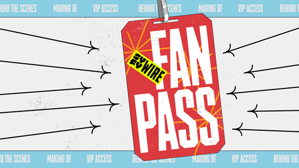
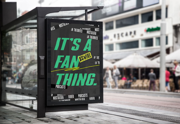
“For our SYFY WIRE guide, we set out best-practice guidelines that are flexible enough to allow designers to take ownership of the brand. For example, the logo sticker can be placed almost anywhere, at any size you want– even upside down. Our guidelines just specify that the slicker always be touching something in the composition, and is never perfectly straight. The library of graphic comic book POWs, used to add visual flare to a composition, can also be used anywhere at any scale. Our only suggestion is that the line weight in any one composition remains consistent.”
All of these materials were supplied in formats that also allowed flexibility. The guide was delivered as a live Google Doc that can be updated as the brand evolves. The POWs were delivered as individual vector files, the generic toolkits were built in After Effects and delivered as project files and the client also received layered Photoshop files of all mock-ups so that they could be pulled apart and repurposed in new ways.
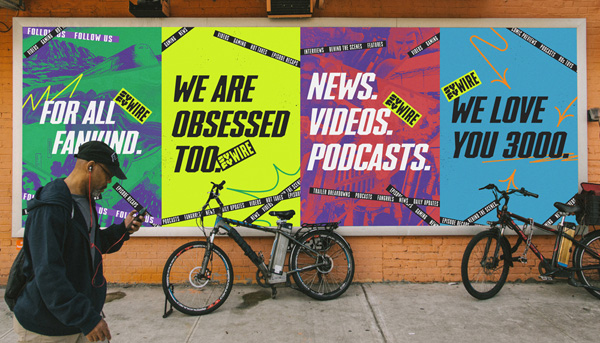
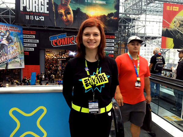
Comic Con
The rebrand is now appearing on social media and in franchise, advertising and experiential content, but fans actually had their first real look at New York Comic Con (NYCC) in early October 2019. Adam said, "The timing of New York Comic Con worked well for SYFY and for our team. We had already established the major elements of the identity, so designing billboards and decals for the convention centre was an opportunity to test out the new ideas. Seeing the brand come to life at 60ftx30ft was incredible, especially amid the excitement and passion of the fans attending the event."
Podcast catalogue on iTunes
Brand Masters
Since they often need to approach projects as outsiders looking in, Adam feels it’s important to understand the culture they are designing for. “We start every project with a certain amount of intellectual rigor – researching and discovering all that we can about the subject,” he said. “Once we’ve absorbed that knowledge, designing is a way to parse all that information. We explore different avenues as we try to make sense of everything.
“At that stage, a lot of the decisions we make are based on intuition – we create whatever feels right in the context of the assignment. Often, the connections to more general concepts reveal themselves only when you step back and look at what you’ve made.
“Once we’ve established the foundations of the project, we hone in and polish it up. Free exploration opens up the possibility of finding something unique, but at some point you do have to focus on the specifics and deliver the project.
“As we’re defining the elements in an identity, we always come back to check our work against the core values described in the brief. For WIRE, it was the obsessive passion and excitement of fandom. Do the colours support that idea? Yes! They are based on vintage comics. Does the logo placement support that idea? YES! It’s applied like a label of authenticity on a rare comic book – and so on.”
Last Words
For BLOCK & TACKLE, the details can be as important as the concepts. The italic block font you see on many of the posters and signage in the SYFY WIRE package was derived from the SYFY Master Brand font, called Hero. Adam said, “They were using a bold, straight font that feels super heroic but was missing the energy and flare that the new identity needed.
“Initially we just sheared and stretched the HERO font to create whatever angled excitement we wanted. It felt like the right thing to do. As the look developed, we settled on a new extended and italicized version of the font that we call ACTION HERO. Its inherent energy is the typographic form of the rebrand concept.” www.blockandtackle.tv


