

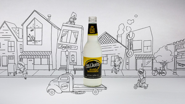
Production company Sarofsky animated the story of mike's Hard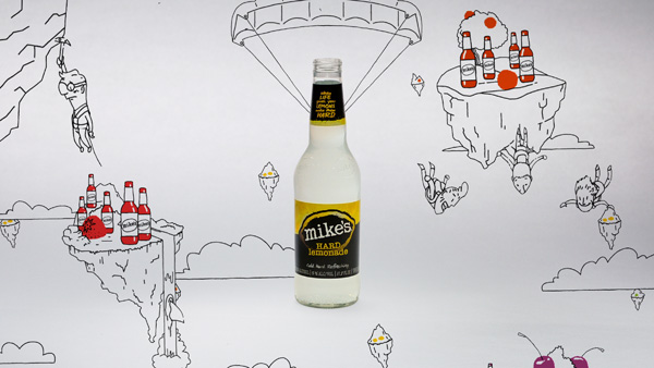
Lemonade in a world based entirely on 2D vector artwork, populated
by a crowd of characters brought to life with IK rigging.
Sarofsky Animates the Wild World of mike's Hard Lemonade |
| Production companySarofsky Corporationin Chicago were commissioned by local firm mike's Hard Lemonade Co and agency TRISECT to create a commercial revealing the company’s history and the story behind their distinctive product. |
 |
|
Refreshing"We set out to show off the high-quality ingredients that make a Mike's hard lemonade so refreshing," said Sanjiv Gajiwala, VP of Marketing, Mike's Hard Lemonade Co. "A lot of brands in the alcohol beverage category talk about quality, but Mike's is an authentic, unconventional brand. Rather than use sweeping shots of verdant lemon groves, we chose to capture this story in an unexpected way." |
  |
|
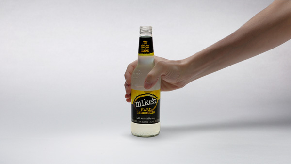
Still FramesAlthough the animated characters and world Sarofsky's artists created were obviously central to the project, so was the original HD product cinematography of the hero bottle. That footage was captured in Sarofsky's in-house studio. From there, because the live action bottle was to remain centre frame while the world spins around it, shot composition was important, “We started this spot the same way that we begin all of our jobs, with still storyboards,” John said. |
 |
|
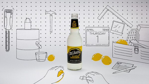
The artists created their characters and worlds in Adobe Illustrator, then imported the vector artwork into After Effects and used puppet tools and inverse kinematic rigs to give them life and personality. The live-action passes were graded in Autodesk Smoke, and extra animated elements were created using Cinema 4D and Maya, and Nuke was used for compositing and clean-up. Final animations and composites were then finished in After Effects. |
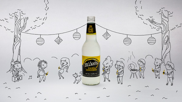 |
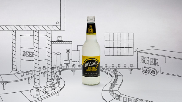
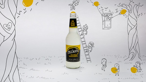
Camera RulesAn unusual aspect of the project is the camera work. From the live action point of view, the camera is static, but meanwhile the camera for the animation follows a lorry, an airplane, a hot air balloon and so on. “We approached things a bit differently on this job,” explained John. “Because the bottle was always going to be in the centre of frame, we created a bunch of rules for the animation to keep us in line - for example, no animation ever passes in front of the bottle. Sticking to those guidelines throughout the process helped us create the interesting movement and perspective throughout the piece.” A further challenge was creating a feeling of depth in the overall design, despite the limitations of black-on-white vector artwork, and getting the props, creatures and characters to interact accurately with the bottle and to recede effectively into 3D space. They didn’t have the benefit of cues from lighting, shadows, camera effects, atmospherics or even different line weights in the artwork. Nevertheless, the world does not seem completely ‘flat’. |
 |
|
By using perspective and parallax,” said John. “We created a strong sense of depth. The subtle shifts between objects can create that feeling of space, and because it worked so well on this occasion we tried to use the technique as much as possible.” Agile CharactersThe artists also didn’t have much choice about their colour palette, although the colour yellow can sometimes be tricky to work with, especially in a white environment. “Mike’s hard lemonade is all about the black, white and yellow,” he commented. “At the beginning, we wanted the line work to be black and executed as simply as possible, but we needed to carefully consider how to handle the yellow. After a bit of exploration, we all decided that it worked best when we used it as a tool to highlight flavour.” |
|
|
The best part of this story, of course, is the agile, charming characters. Their design – slightly stubby but lively with a lot of personality – looks and IK rigging relied mainly on the work of illustratorChris Anderson.Using expressions and the puppet tool in After Effects, the animators were able to achieve an impressive range of fluid motion. John said, “From there, it was up to the animators to bring individual subtleties to the characters. We went through a few rounds of character development and ended up being inspired by the minions in the film, ‘Despicable Me’. “Most of the different tools were used because they are really the best for the job. Adobe Illustrator was used for its ability to create vector art that can be manipulated in After Effects without losing quality. As far as 3D goes, that was more up to each individual artist. If they could create the same line quality from their program of choice, they were free to use whatever they wanted.”http://sarofsky.com. |