

Nathan Love recently worked on a frenetic and humorous new campaign
for Kellogg’s Krave cereal that combines fast-paced animation with melting,
delicious looks.
Nathan Love Animates a Bigger Bite for Kellogg’s Krave |
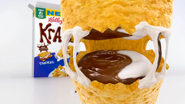
| Design and animation studio Nathan Love recently worked on Leo Burnett’s frenetically humorous new campaign for Kellogg’s Krave cereal that combines fast-paced animation with melting, delicious looks.. The spot is the most recent of their work with Kellogg’s, following the 3D CG redesign ofFroot Loops’ mascot Toucan Samand a series of lively animated projects for other brands like Chips Ahoy and Pop Secret. |
|
|
Nathan Love Executive Creative Director Joe Burrascanosaid, “This was a fun change of pace – trading in the lush, detailed world we built in the Froot Loops spots for a plain white, minimalist environment. It’s been a great opportunity to show off the range of our ability.” Their energetic animation places elements on an all-white background and combines oddball comedy, complex choreography and engaging character design, building up the narrative into the short 15-second runtime. Joe’s role involved putting a lot of effort into directing the animation to work with both the CG and the story aspects of the project. He said that while their goal is always to pack as much fun as possible into the spots they produce, in this case, dealing with a limited timeframe involved bypassing the traditional storyboard phase and diving straight into a 3D previz. “Based on our experience, developing the story while simultaneously considering layout, performance, camera and pacing saves a lot of time and allows us to experiment with every filmmaking tool available to both deliver the brand’s message and create the best experience for their audience,” he said. |
 |
|
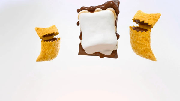
“We typically brainstorm a lot of fun ideas to include in this type of spot, but only a few of them make it in. To work in a 15-second piece like this, those details have to compliment the storyline and not stand on their own, no matter how funny they are, because the most important job is making the story clear and ensuring that the audience focuses on the right details.” A major focus for the team was on taste appeal. Even though they were portraying food as live characters, they had to look tasty enough to make the product appealing and edible, a challenge in itself. “We planned the story around the way the chocolate melts when it warms up, for example,” Joe said. “The way the marshmallow toasts and other intentional close-ups remind the audience of the flavours associated with the product. We also put a lot of effort into portraying the Chocovores – the cereal - to look crunchy and delicious, while staying true to their characteristic chaotic personalities.” |
 |
|
Because there was scarcely any environment or atmosphere to tie all elements and action together, the characters took centre stage, and because of that, they spent more time ensuring texture and surface quality. They planned the crumbs that fly out after a crunch and the tiny cracks that appear on the surface of the toasting marshmallows. “Many of the melted chocolate effects were done in ZBrush. While the chocolate is sitting at the table, a section of him starts to melt. We modelled this melted version in ZBrush and animated the original shape to morph into the melted shape. For the chocolate inside the Chocovore's mouth we went through multiple phases of design, tackling how it would look purely through concept art, before we had an approved design that we could model and rig accurately.” |
 |
|
The animation reveals a huge amount of personality in the high speed performances – a chaotic, hungry and mischievous pair of characters that work together to gang up, trick and devour their favourite snack. “Although the cereal is essentially a rectangle, after examining all the different ways they've moved through past commercials, we established freedoms that we could take with the characters' shapes that helped us animate their performance,” Joe said. “For example, their corners are flexible - especially the bottom corners - as feet that can bend and walk or run. The front part of the Krave shape has a ‘belly’ that bulges out to create an indication of posture. And the mouth, of course, is their most important characteristic element. A lot of personality can be shown through the mouth, and the more chaotic they get, the more that laugh hinges wide open, to create a more crazed feel to the performance.”www.nathanlove.com |